Alcott House
This project explores the creation of a typographic identity system for Orchard House, the historic home of Louisa May Alcott in Concord, Massachusetts, where Little Women was written.
I approached the work as a way to translate the house’s layered history, architecture, and surrounding landscape into a visual language that feels both grounded and alive.
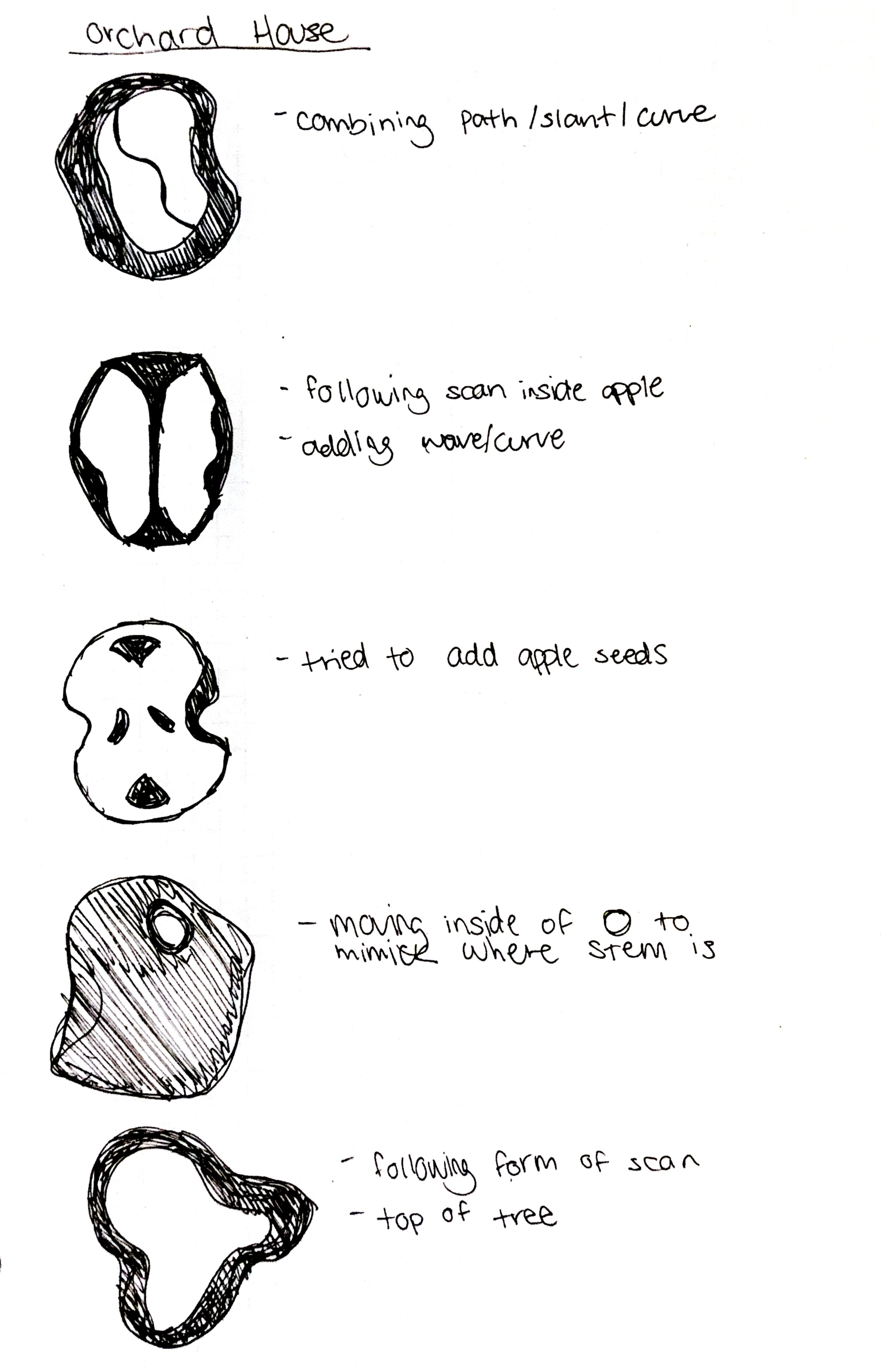
The concept, slope and curve, emerged from Alcott’s nickname for the home, “Apple Slump.” This idea reflects both the slanted architecture of the house and the organic movement of the orchard. I was drawn to the subtle ways these forms appear throughout the space, from leaning staircases and arched fireplaces to the branching structures of apple trees. These observations became the foundation for a typographic system that emphasizes movement, growth, and rhythm.
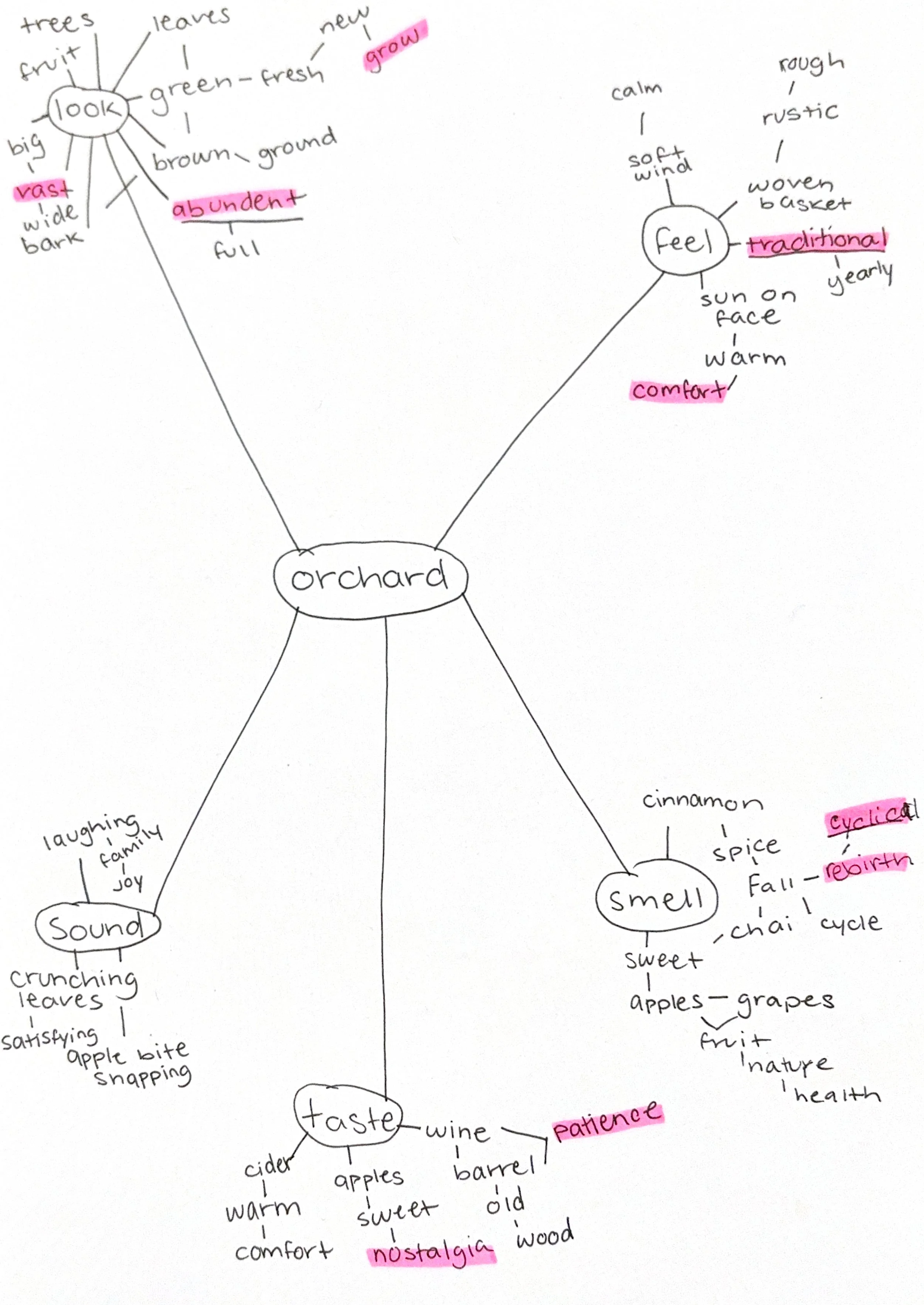
My process began with mind mapping and research, where
I identified key themes such as growth, patience, transformation, and reliability. I studied the history of Orchard House, its preserved interiors, and the natural forms of heirloom apple trees. I also explored a wide range of typefaces, setting “Orchard House” in each to understand how tone, structure, and readability shift through typography. This helped me think more critically about how type communicates meaning.
From there, I moved into sketching and experimentation, translating ideas of slope and curve into letterforms. I worked both digitally and physically, using scanning and iterative refinement to push the forms further. This stage allowed me to explore how small shifts in form could suggest movement or imbalance while still maintaining clarity.
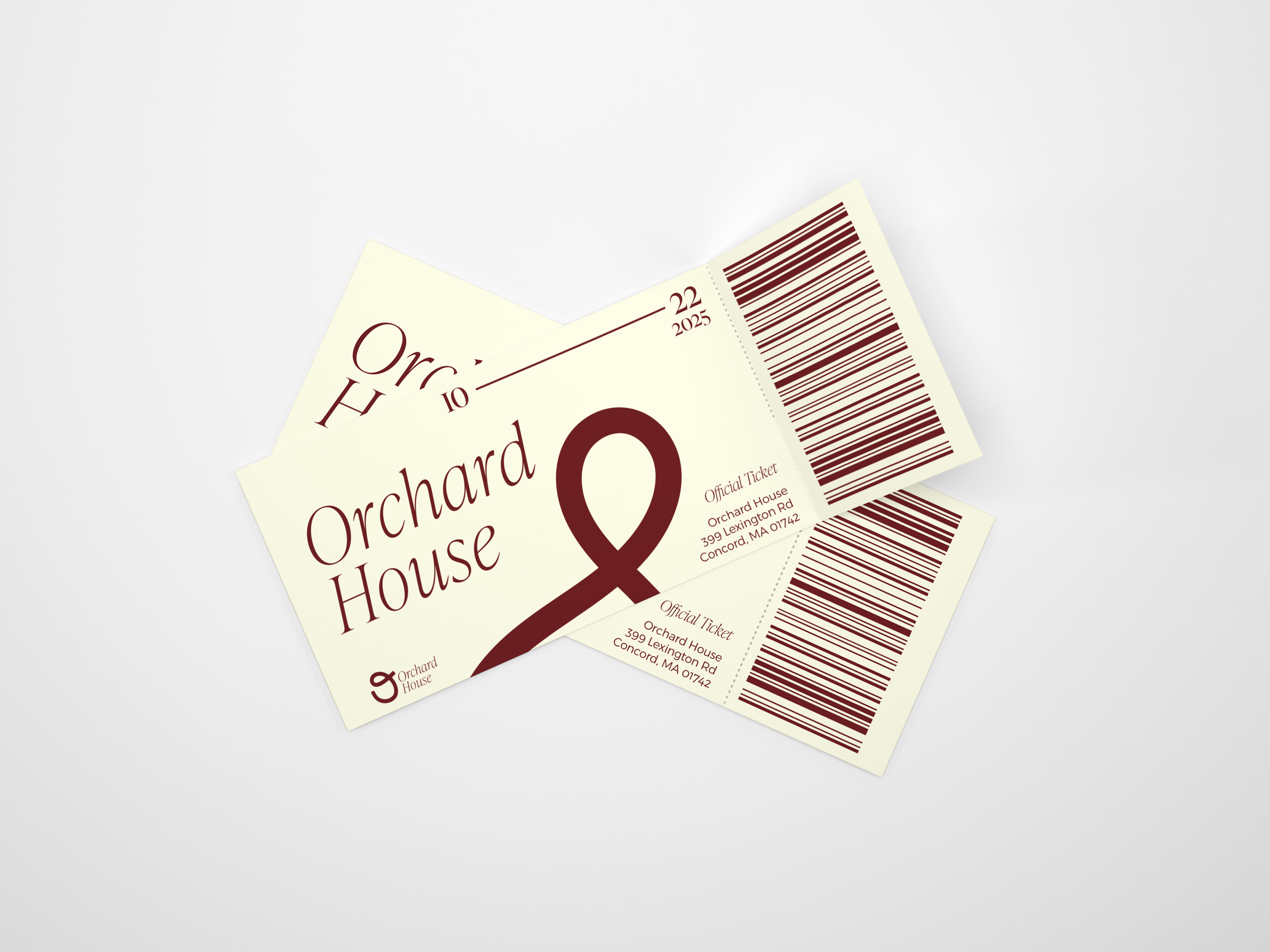
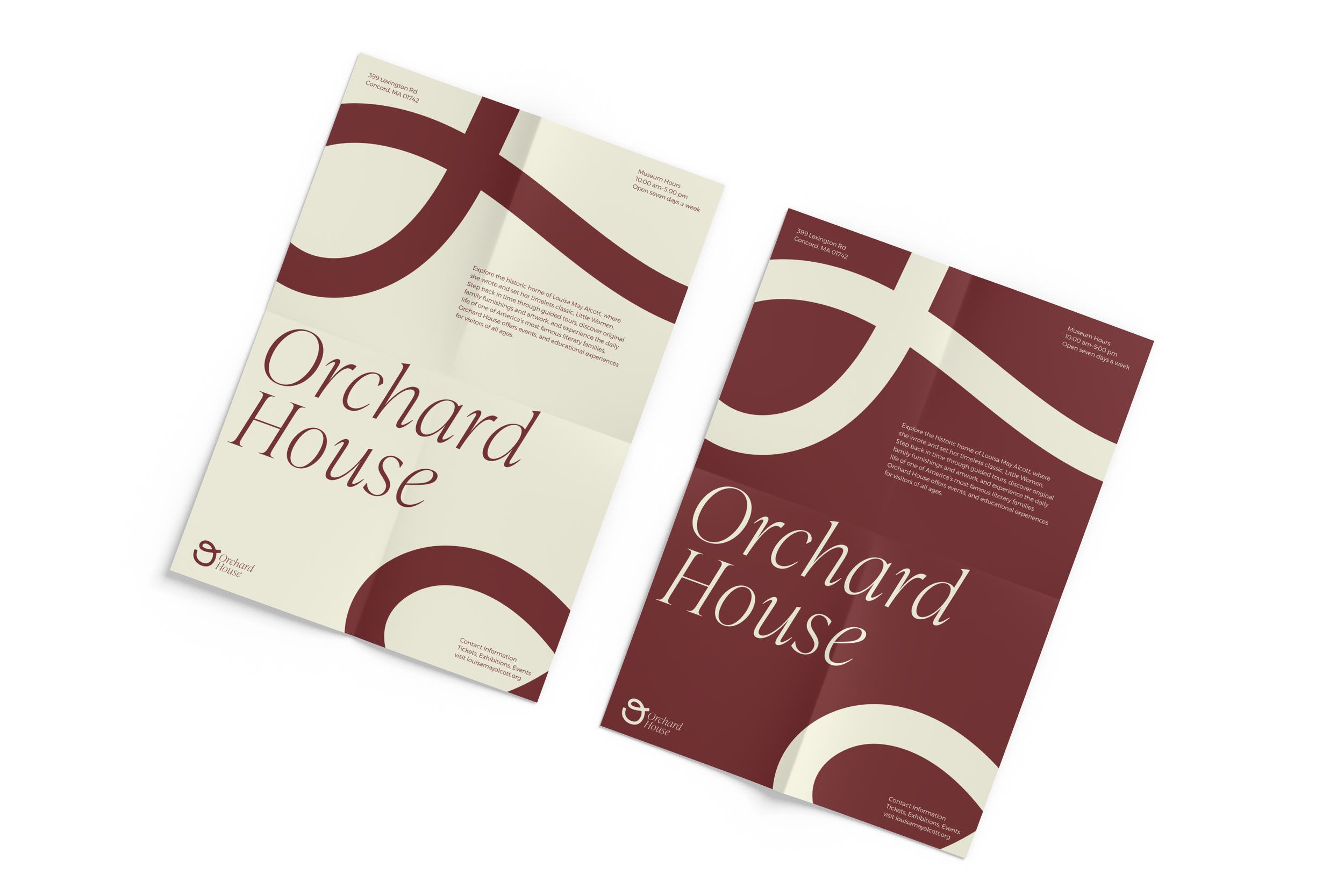
As the system developed, I focused on balancing expression with function. I refined the letterforms to create a sense of flow and cohesion while maintaining readability. Color also played an important role, and after experimentation, I chose a palette rooted in historical reference, using deep red and warm cream tones to reflect the materiality and atmosphere of the space.
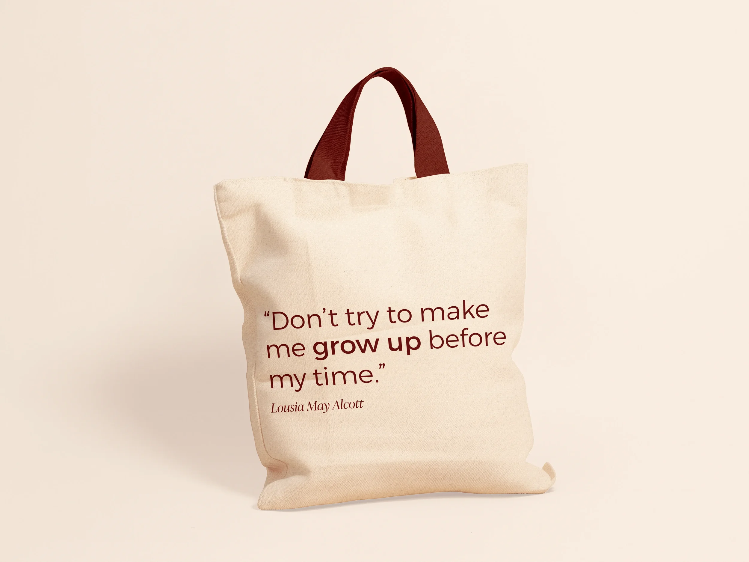
I applied the identity across a range of materials, including posters, visitor guides, and invitations, to understand how it functions in different contexts. These applications allowed the typography to act not just as text, but as a structural element that guides layout and creates movement.
Every decision was tied back to research and concept, reinforcing the importance of intentional design. This project reflects my approach to creating work that is thoughtful, exploratory, and rooted in storytelling.
-
Illustrator
Branding
Typography